This template uses Ultimate Addons for Elementor (UAE) to create the header and footer using Elementor Free. The plugin is automatically installed during the template kit setup. If the plugin is installed correctly, you will see the UAE menu in your WordPress dashboard.
Since this template uses Elementor Free, the header and footer styling works slightly differently than Elementor Pro (Feel free to use the Elementor Pro version which is easier to setup).
Header Setup
To edit the existing header design, go to: UAE → Header & Footer, Find “Header” page/template, then click Edit with Elementor.
From here you can customize:
- Your site logo or blog title
- Navigation menu items
- Social media icons
- Search button
- Mobile menu
After making changes, click Update to save.
Additional Notes for header design
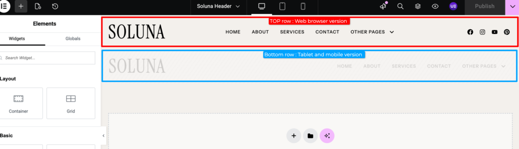
You will see two header rows in the header design (see attached image):
- First row – used for desktop / web browser
- Second row – used for tablet and mobile devices
The mobile row is only visible on tablet and mobile screens. If you edit elements in one row (for example the logo, menu, or icons), make sure to apply the same changes to the other row as well, so the design stays consistent across devices.
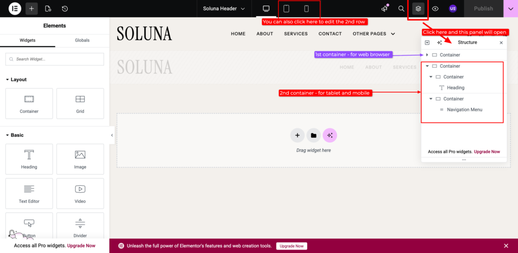
If the Mobile Header Cannot Be Selected
If the mobile version (the bottom row) cannot be selected or edited, you can : 1) Switch to Tablet / Mobile or 2) turn on the Structure/Layer Guide in Elementor. Once the Layer Guide is enabled, you can select the correct row and edit the mobile header layout. You can view the image bellow or watch the video tutorial.
See the video bellow :
Setting Up the Menu
To set up your navigation menu, follow this instruction: click here
Footer Setup
To edit the existing footer design, go to: UAE → Header & Footer, Find “Footer” page/template, then click Edit with Elementor.